

Working remotely using Teams and Office 365

[vc_row][vc_column][vc_column_text]Like many others, I am now working for home as part of efforts to keep our colleagues and our teams healthy and manage COVID-19 infection rates. As a regular remote worker and user of Microsoft Office 365, this transition has been seamless for me.[/vc_column_text][us_image image="7294" size="us_600_400_crop" align="center" meta="1"][ultimate_spacer height="32"][vc_column_text]Using core elements of Office 365 such as Exchange and SharePoint to power Outlook, Teams, OneDrive, OneNote, and Planner means we have been able to continue without missing a beat. My telephone extension is also a Teams number, so I can still make and receive telephone calls as usual (with the benefit of emailed voicemail transcript and MP3 file).[/vc_column_text][vc_column_text]For those who are new to remote work, the Microsoft blog has had several posts to help with this transition.
- Staying productive while working remotely with Microsoft Teams
- Working remotely during challenging times
- The top 9 ways Microsoft IT is enabling remote work for its employees
[/vc_column_text][vc_column_text]IT leadership and Microsoft deserve kudos for building a sustainable solution for businesses and teams of all sizes. I can work from anywhere with access to the tools and resources I need to deliver[/vc_column_text][/vc_column][/vc_row][vc_row][vc_column][/vc_column][/vc_row]

Borrowed time

[vc_row][vc_column][vc_column_text]
The link
[/vc_column_text][vc_column_text]Borrowed time, Seth Godin[/vc_column_text][vc_column_text]
What’s it about?
[/vc_column_text][vc_column_text]
The shortness of time.
[/vc_column_text][vc_column_text]
What did it trigger?
[/vc_column_text][vc_column_text]
Thoughts around my focus and goals relating to family, health, business, and career.
[/vc_column_text][vc_column_text]Interesting links are things that have prompted me to stop and think. At times they cause me to rethink my approach to an area of my life. I found each link useful, and you may find them helpful too.[/vc_column_text][/vc_column][/vc_row]

Working towards perfection


Posts in my links of interest category are things that resonate with me about current topics, projects, events, or focus.
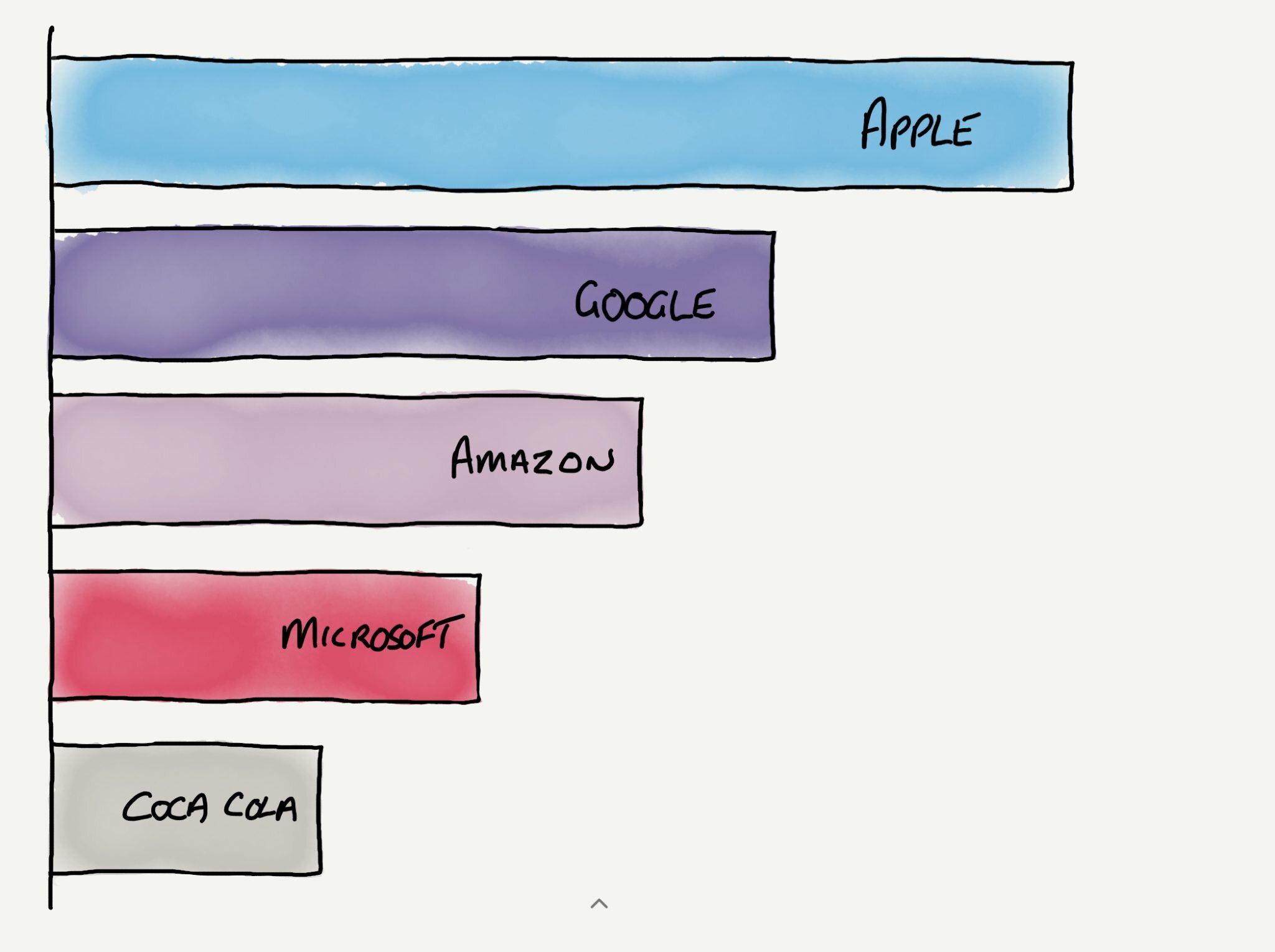
Bar Chart Race: How to Make Your Bar Charts Stand Out from the Crowd

I was at the WPEngine Summit 2019 technology event in London last week and the keynote presenter was Jeremy White, Executive Editor of Wired UK. In his presentation, Jemery showed a bar chart race of brand value over time of the biggest brands in the world by value.
I've seen this chart, based on data from Interbrand, multiple times. It shows the market value of the world's biggest brands over time and displays the year in the bottom right corner. In this chart, you can watch the arrival of Google (2007) and then Apple (2011) and their movement through the list of brands.
Best Global Brands
Value in $M; color indicates sector. Data: Interbrand
What I discovered, quite by chance, is the required code and instructions on how to create your own bar chart race with your data. Mike Bostock on Observable details the structure and method to create your own version. I think that Mike has done an incredible job of making understandable the complexity that is behind the simplicity of what we see presented.
Photo by Isaac Smith on Unsplash
Multi-layered design

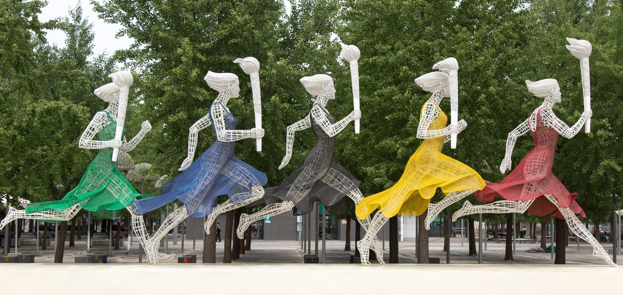
The Paris 2024 Olympic Games Organisers on 21 October 2019 released the emblem and logo for the 2024 Paris Olympic Games.
Paris 2024 logo
This logo design is on three levels. It combines three different images in one - the gold medal, the Olympic flame, and Marianne, the official symbol of the French Republic.
“Using a human face as our symbol is intended to convey that these Games are for the people, by the people. It reflects the universal values of sport, liberty and equality.”
The Games Organisers will be releasing more of the Paris 2024 design system, team logos, and uniforms.
“By associating three iconic symbols – Marianne, the Olympic flame and a gold medal – the Paris 2024 emblem elegantly reflects the people-focused, fraternal Games France intends to host. And because the Olympic and Paralympic Games form two sides of the same coin, in 2024 they will share the same emblem for the first time ever, symbolising the pursuit of the same vision and the same ambition for both events.”
As a designer I love to inspect professional design systems. The Paris 2024 Design System is a pleasure to read and to view.
“We believe this logo captures the essence of Paris as a forward-thinking, modern capital city that is also proud to celebrate its rich culture and heritage.”
In conclusion, this design is an incredible work of art. Above all, to deliver so clearly on three different levels, with a design in itself that is modern, Parisian, feminine, and powerful.

Rethinking the exit we will all make

Design is such a powerful tool that when it is used well, can be life-changing. My Godfather is a funeral director and has been for many decades, so this article on rethinking and redesigning death and funerals had a great resonance with me.
Change is ever-present. If we want to affect the outcome of a process using design, we need to approach it from all angles. Sometimes we need to rethink the entire process from top to bottom, and inside out. Creative Review has a great article about rethinking a process that we all encounter, that of funerals - Exit Here: The Future of Funeral Planning?
While the core elements of a funeral remain the same: collecting a body; preparing it for burial or cremation; and the conduct of a ceremony. By being willing to reconsider how the funeral industry approaches its core service, Exit Here has used design thinking to reimagine the customer journey and experience.
There was also a conscious decision to “all but eliminate black from the funeral world”, … opting for a neutral but more cheerful blue instead.
Ben Masterton-Smith, Director at Transit Studio

Without changing the function of a funeral parlour, but by changing the visual appearance of a funeral parlour, subsequently changes the experience from the start. Similarly, looking at how you can change other pieces of the user journey, such as bright yellow coffins and modern blue urns help to shift focus. By including options such as the choice of being buried on a farm the design team have, in short, reimagined funerals. We are all different, and no two funerals should be the same.
“You want to leave people with a positive memory of your life. You want people to think, ‘that’s the person I knew and loved’ – and I think we need to try and change the compass on how people see the culmination of their life. Of course, no-one wants to die, but we’re all going to – we know it’s coming – so let’s make it a more joyous affair, particularly for the people left behind.”
Oliver Peyton, Exit Here
This is an excellent example of rethinking the approach to a problem and improving the experience for those involved. What could you reimagine by changing your approach?
Photo by Kerri Shaver on Unsplash

It's all about your systems

“You do not rise to the level of your goals. You fall to the level of your systems.”
This quote has hit a nerve for me today. James is the author of Atomic Habits, a book I'm currently reading. This book has four laws to help you set and maintain good habits that support your goals and change your life.
James' four simple laws are to:
- Make it obvious
- Make it attractive
- Make it easy
- Make it satisfying
If your systems follow these principles, your foundation or baseline will be high.
I've got my top five personal goals that I'm working on, and I've also got some positive systems that I use, such as Getting Things Done and slip-box notes. But, in some areas, I am finding it challenging to achieve the results I want.
James' quote above has inspired me to do an audit of the methods I use in the areas of my life where I'm finding challenges. Accepting that my goal is achievable, James hit a nerve with me on this one.
Is my approach relevant, and are my systems supporting me to produce the desired results? If not, what do I need to change or improve?
What about you? Are your systems helping or hindering you? What can you do to build systems that support you in your goals?

What's your role at work?

The IDEO blog had a great post today about physical office design. Well, it claims to be about office design but it’s not.
It zigs and then zags through office design, fit-out specifications, interior design, communities, collaboration, and the hidden roles that we, and our colleagues, play. Some of these roles are often not recognised until those who played them are gone. If we can identify and remember these roles, they could be built upon to improve results.
“... I think about all the potential we can unlock by holding the cultural and emotional components of work alongside legacy approaches to productivity and architecture. Our challenge—and our interest—is weaving those parts into a greater whole.”
I believe we live in an era where it is important to improve our connection to our communities and those around us. I think that this post from IDEO is one of the best I’ve read in a while.
What Comes After Open Offices? It Doesn’t Matter, As Long As Culture Comes First
Photo by Brooke Cagle on Unsplash
Using design to fix a structural issue impacting civil society
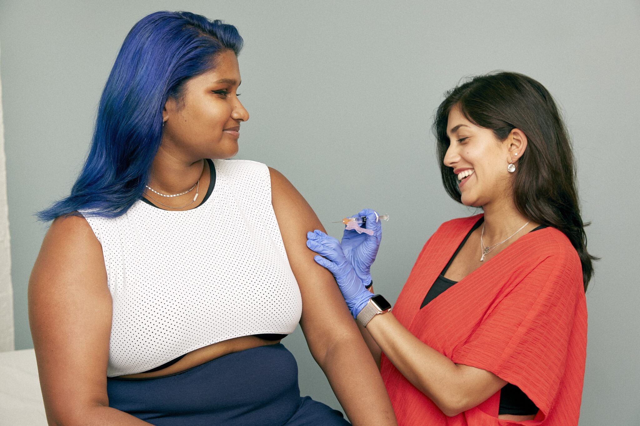
The social scientist in me loves the passion with how Mark Wilson opens his article using design in favour of vaccination.


The social scientist in me loves the passion with how Mark Wilson opens his article using design in favour of vaccination.
Let the anti-propaganda campaign begin!
Mark Wilson
This is a great article in Fast Company around using design to produce a change in perception around vaccination. The problem around vaccination is not confined to America alone. Vaccination rates are decreasing in the United Kingdom and other parts of Europe such as Italy. A good read, with real-world images to communicate messaging around vaccination.
The misinformation behind the anti-vaxxer movement has gone far enough. The United States is on the precipice of a major measles resurgence because of pseudoscientific propaganda. We need more resources that truthfully and clearly communicate the science from the CDC and WHO that proves that vaccines are safe—and you should have your children vaccinated for everything from the flu to polio.
Mark Wilson
What else could we achieve by rethinking how we use images to tell a story?

The importance of learning now, and in the future
The illiterate of the 21st century will not be those who cannot read...

Quotes I Like
The illiterate of the 21st century will not be those who cannot read and write, but those who cannot learn, unlearn, and relearn.
Alvin Toffler
I discovered this quote while reading Design Thinking for Strategic Innovation by Idris Mootee. I’m taking extensive notes from this book that I will use to help solve some of the strategic issues I’m working on right now.